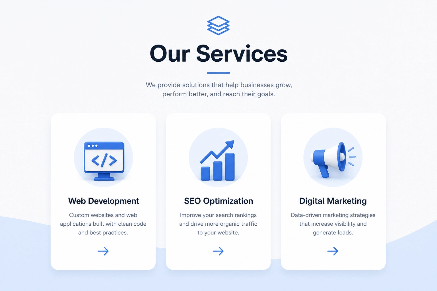
The 12 elements in this guide show how each part of this type of website can support users, search rankings, and conversions. You will learn how to organize several offers, write clear copy, use images, improve access, and create a better mobile and desktop experience. This approach follows the SEO, site structure, and user experience methods SSinvent uses when reviewing service-focused websites.
Key Takeaways
- A strong service-focused website explains what the business offers, who each offer is for, and what users should do next.
- A clear layout should include focused descriptions, benefits, pricing context, proof, and well-placed calls to action.
- Businesses with many offers should use a hub-and-spoke structure, with one main overview linking to each individual service page.
- Mobile use, accessibility, loading speed, internal linking, and SEO all affect how easy the content is to use.
- Performance should be measured through search data, form use, real conversions, and testing instead of traffic alone.
What Makes a Strong Service-Focused Website?
A strong overview helps users understand the problem, the solution, the process, and the next step. Visitors should not have to search through many sections to find basic details.
A services page on a website should help both users and search engines. Users need clear answers. Search engines need focused text, clear headings, useful terms, and internal links. A high-converting service page works best when it is clear, useful, and easy to trust.
How to Plan the Content
Planning should start with user needs, not visual style. The business should first define its audience, main offers, common concerns, pain points, and primary conversion action. These details help shape the layout.
Define User Intent
Some potential customers want to compare providers. Others want prices, key details, or fast contact options. The content should answer the main need first.
Search terms, sales calls, forms, and support questions can show how users talk about their needs. The copy should use this language naturally.
Map Pain Points to Content
Each main concern should have a clear answer. Users who worry about price need cost details. Users who question trust need proof, reviews, or clear credentials.
This step keeps the content from becoming a list of random claims. Questions about the process belong in the process section. Questions about results belong near case studies or reviews.
Select One Primary Action
The layout should have one main conversion action. This may be asking for a quote, booking a call, filling out a contact form, or visiting an individual service page.
The action should match the offer. A simple option may support direct booking. A complex one may need a first call or review.
12 Essential Elements
1. Clear Value Proposition
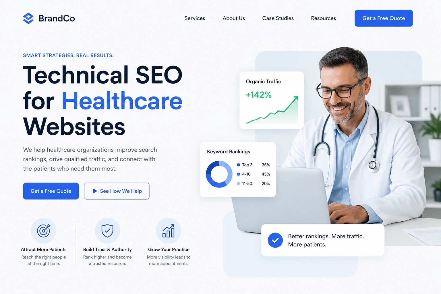
The first section should say what the company does and who it helps. Clear wording such as “Technical SEO for healthcare websites” gives more detail than “Grow your online presence.”
The value proposition should appear near the top. It should connect the offer with the main needs of potential customers.
2. Focused Descriptions
Each description should explain the goal, scope, key tasks, and limits. Users should know what is included and how one option differs from another.
Complex offers may need an individual service page. A focused URL can answer one search intent, target a long tail keyword, and support internal linking.
3. Customer Benefits
The copy should explain benefits, not only features. A technical audit is a feature. Finding speed, index, or site structure issues is the benefit.
Benefits should address real pain points. They should not promise fixed results. This helps potential clients see why each part of the work matters.
4. Visual Hierarchy
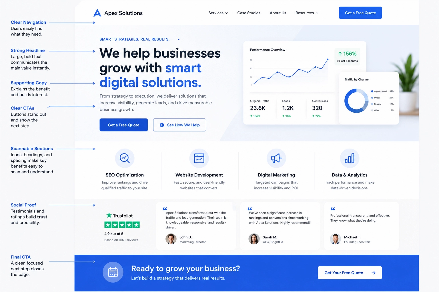
Headings, spacing, font size, contrast, and section order should guide the user. Key details should not compete with visual elements.
Most users scan before they read in full. Good website structure makes offer names, benefits, proof, and next steps easy to find.
5. Relevant Images
Images should help explain the offer, process, tool, or result. Screenshots, charts, and simple graphics often add more value than stock photos.
Each image should use clear alternative text. File sizes should also stay small. Large files can hurt loading speed and mobile use.
6. Clear Process
A process section tells users what happens after they make contact. It may cover review, planning, work, feedback, delivery, and reports.
Rodrigo César and Christopher Cáceres view service structure as a clear flow of steps, roles, and results. The content should explain this flow in simple terms.
7. Pricing Information
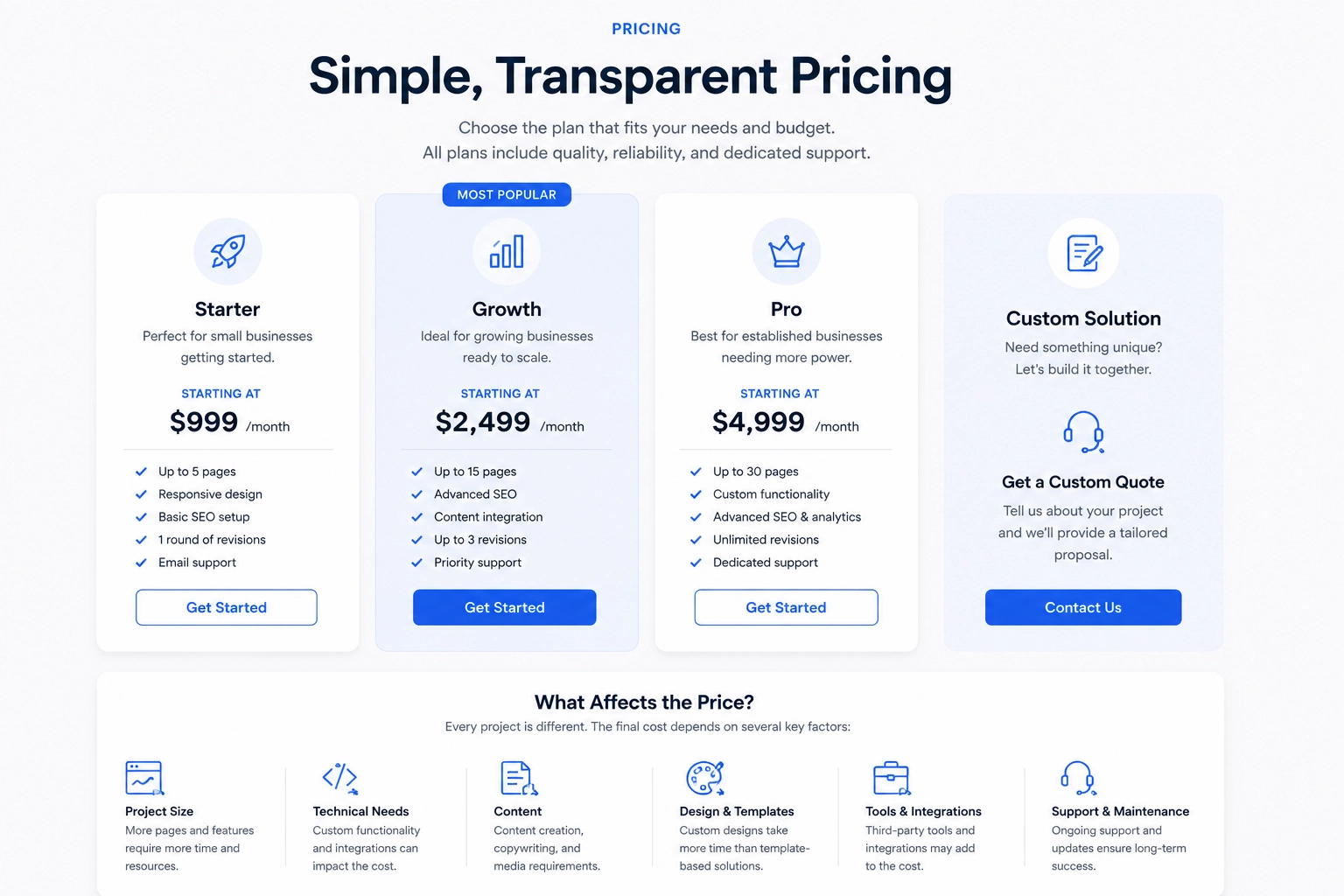
Pricing helps users decide if the offer fits their budget. A business may show fixed prices, starting rates, common ranges, or quote details.
When exact prices are not possible, explain the main cost factors. These may include project size, tech needs, content, templates, tools, and support.
8. Proof and Testimonials
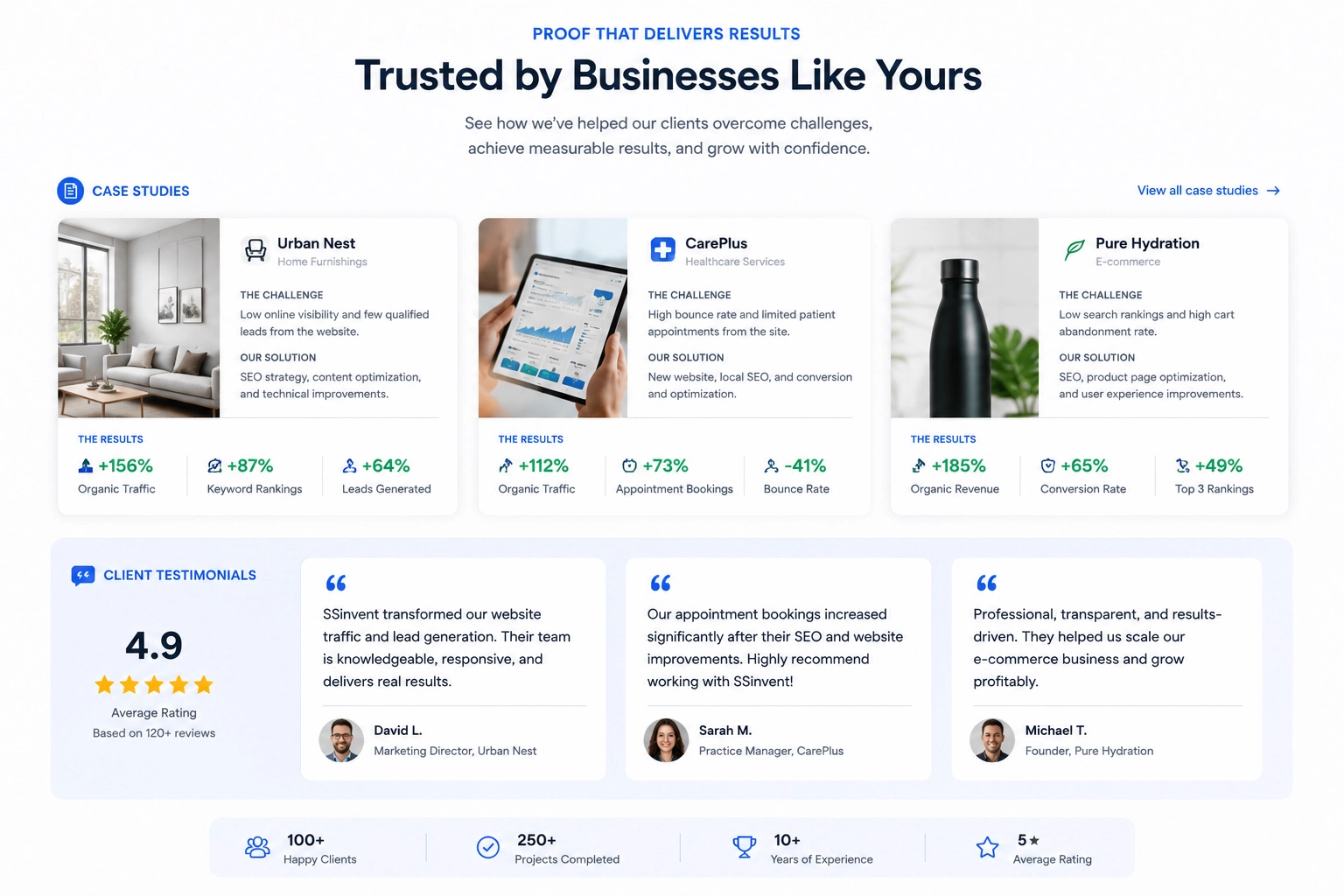
Social proof works best when it is clear and real. Good examples include case studies, client names, project notes, review quotes, and results with context.
Case studies should explain the starting point, the work done, any limits, and the changes seen. One result should not be shown as a promise for every customer.
9. Common Questions
Frequently asked questions should cover issues that may stop users from taking the next step. Common topics include timing, tasks, edits, contact, ownership, support, and payment.
These questions should come from real search data, sales calls, or support needs. They should not exist only for SEO.
10. Clear Calls to Action
A call to action CTA tells users what to do next. It may ask them to request a quote, book a call, view past work, or send project details.
The main CTA should appear near the top and after key details. Too many buttons can make the next step less clear.
11. Mobile-Friendly Layout
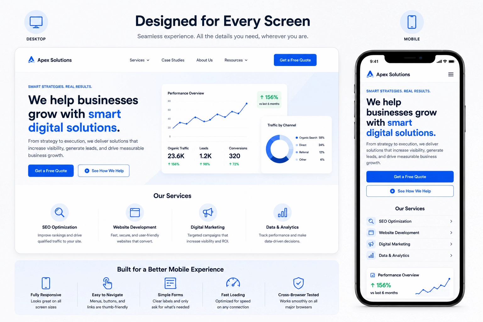
The mobile version should offer the same core details and tools as the desktop version. Text, buttons, forms, images, and menus should be easy to use.
The contact form should have clear labels and only ask for needed details. The experience should be tested on many screen sizes, browsers, and internet speeds.
12. SEO and Accessibility
Search optimization starts with useful content and clear intent. The title, H1, headings, metadata, internal links, and copy should describe the topic in a natural way.
Accessibility helps more people use the site. It includes clear contrast, keyboard use, simple labels, proper heading order, and useful alternative text.
How to Structure the Layout
Hero and Overview
The hero section should show the main offer, audience, and next step. It should give users fast context. It should not begin with a long company story.
The overview can use a list or grid. Each option should have a short description and a link to more details when needed.
Benefits, Proof, and Pricing
Benefits should appear after users understand the offer. Proof can then support those benefits with reviews, case studies, or clear examples.
The process and pricing sections should appear before the final CTA. They answer key questions about how the work is done and what may affect cost.
Final Call to Action
The final section should restate the next step in a simple way. It should use the same main action shown earlier.
How to Organize Multiple Offers
A business with many offers must decide whether to use one overview or several focused URLs. The best choice depends on the audience, problem, scope, and search demand for each option.
Use a Hub-and-Spoke Structure
A hub-and-spoke model uses one main overview that links to more detailed resources. The hub helps users compare offers. Each linked resource explains one option in more depth.
Each URL should cover scope, benefits, process, cost factors, proof, and common questions. The supporting content should also link back to the main hub when useful.
Create Separate URLs for Distinct Intent
Use separate URLs when offers solve different problems or target different search terms. Technical SEO, content strategy, and web development may all need their own dedicated content.
Do not create many thin URLs with the same copy. Each one should have enough new and useful detail to stand on its own.
Plan Internal Links
Important details should be easy to reach in a few clicks. Link text should explain where the link goes. Avoid vague terms such as “learn more.”
Internal links should match the next question a user may have, while a clear link-building strategy can help strengthen the website’s authority beyond its own content. A pricing section may link to a scope guide. A case study may link to the offer tied to that result.
Services Page Content Examples
Professional firms need clear scopes, simple process notes, proof, and direct answers. Local businesses should show coverage areas, hours, booking steps, licenses, and price factors.
Agencies and consultants should separate planning, execution, and ongoing support. Services page content examples work best when they show how the layout fits user needs instead of copying another business.
Service-Focused Websites vs. Landing Pages
A broad overview explains one or more ongoing offers. It may let users compare several choices. A landing page usually supports one campaign, one audience, or one action.
Landing page web design services often create a shorter path around one offer, while SEO for landing pages helps align that focused content with relevant search intent. A wider overview works better when users need to review many options.
Related Web Development Options
Web development services page design should explain tech skills in simple terms. It may cover platforms, tools, speed, safety, project steps, and support.
Web page design and hosting services may include layout work, backups, updates, server care, and tech help. The content should explain ownership, renewals, moves, and the role of both the client and provider.
How Much Does Web Design Cost?
Professional small business website design services often cost $2,000 to $8,000, with about $5,000 as a common average. Custom agency or ecommerce projects may cost $10,000 or more.
Price depends on the number of templates, content, custom tools, integrations, testing, and support. Freelancers may charge less, while agencies often include SEO, strategy, design, and development. Businesses comparing both options may also consider why they should hire an SEO company when search growth requires wider skills and ongoing support.
Common Mistakes
Common issues include:
- Using vague headlines that do not explain the offer.
- Listing features without showing their value.
- Leaving out reviews, case studies, credentials, or company details.
- Adding too many CTAs that compete for attention.
- Using forms that ask for more information than needed.
- Hiding pricing, timing, or process details users expect to find.
How to Measure Performance
Publishing the content is only the first step. A business should check if users can find it, understand the offer, and take the main action.
Track Search Visibility
Review impressions, clicks, click-through rate, average rank, search terms, and landing URLs. This data shows whether the main overview and supporting content match the right topics.
Traffic alone does not prove success. A website may bring in the wrong users or rank for terms that do not match the offer.
Measure User Actions
Track form sends, booked calls, phone clicks, email clicks, downloads, and pricing views. Each event should show real user interest.
Review form starts, drop-offs, and completed forms. High drop-off rates may point to too many fields, tech errors, weak privacy details, or a poor match between the CTA and form.
Test Meaningful Changes
Use SEO testing to review one clear change at a time. This may include a new headline, shorter form, better CTA, or new proof placement.
Sites with low traffic can use user tests, customer talks, screen recordings, and before-and-after checks. These methods can show where users get stuck.
Service Content Checklist
Before publishing, confirm that the website:
- Explains the main offer and target audience.
- Uses clear descriptions and practical benefits.
- Addresses pain points without making bold claims.
- Includes proof, process details, and pricing context.
- Uses one clear primary call to action CTA.
- Works well on mobile devices and supports accessibility.
- Links to each individual service page when more detail is needed.
- Uses clear headings, internal links, and natural keyword placement.
- Provides a working contact form and clear privacy details.
- Gives users enough information to choose the next step.
Final Thoughts
A well-structured services page helps users understand your offer, compare options, and decide on the next step with confidence. If you want to improve your website’s structure, SEO, or conversion rate, consulting an experienced web design and SEO team can help you identify opportunities and build a clearer path for your visitors.